 Let's Talk
A lot of the conversation around web design recently has been around the necessity for a responsive web design. Some people will tell you that you need a responsive website in order to rank in search engines, and others will tell you about the ‘mobile revolution’ that is driving people away from their desktop computers. I’m not interested in issuing any sweeping proclamations regarding a need for responsive web design, but I would like to illustrate a specific case in which responsive web design would be very helpful.
First of all, what is a responsive web design? A site with a responsive design adapts to whatever device is being used to view it. This means that elements on the page like images and areas of text won’t end up overlapping or taking up the entire screen unnecessarily. This means that you don’t need to design a mobile website that is specifically designed for a certain screen size. The existing site will adapt to the screen you put it on.
The website in this case study belongs to a relatively small business, currently working on their SEO. There are many small businesses in this same position. They recently decided to change the design of their homepage, but they did not make that design responsive. As a result, the mobile experience of the site was not very good; elements were overlapping to the point where it was impossible to read the page. Here is a snippet from the analytics of their homepage as a landing page:
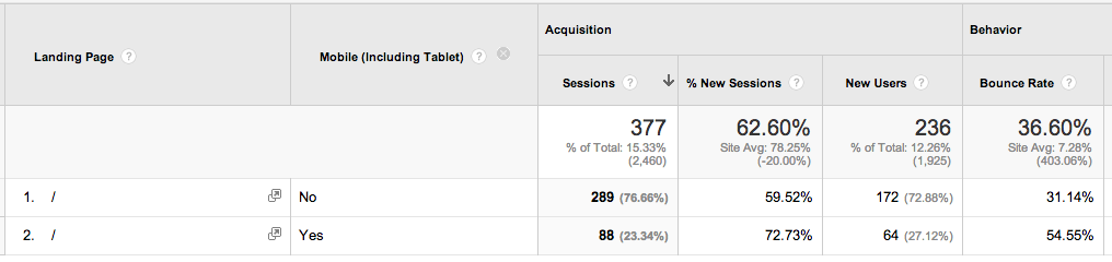
Their homepage was their second most popular landing page, so I divided the landing traffic into mobile and non-mobile entrances. Immediately, I could see that mobile traffic landing on their homepage accounted for a significant portion (23.34%) and that the bounce rate on mobile devices was much higher (54.55% vs. 31.14%). While we can’t say exactly why that 54.55% bounced off the homepage, I think it’s a fair assumption that the difficulty of the design had a lot to do with that.
So while I don’t want to tell you that a responsive design on your website will solve any and all problems you are having, it seems like in this case, it would be a good idea. When considering a responsive website design, think about how much of your traffic actually comes from mobile devices.
P.S.
Sometimes, when discussing mobile websites and responsive design, my clients ask if they should just build an app instead. Mobile apps are great, and there is nothing wrong with building a mobile application for your business, but I often advise them that the biggest reason to develop a mobile app is if you are using a native feature of the mobile phone, such as a camera or accelerometer. If you aren’t using these features as part of the functionality of the app, you might as well spend that time and money designing and developing a good mobile website with the specific features you want or responsive website that provides a consistent user experience across all platforms.
P.P.S.
If you have any questions about whether you need a responsive website, a mobile website, or a mobile application, give us a call, and we’ll help you decide what is best for your business.