Typography is often treated as an aesthetic, visual design concern. While it’s true that type can have a profound impact on the look and feel of a design, its impact on UX is similarly immense. A recent study authored in partnership between Microsoft and MIT looked at the relationship between typography and the UX of reading on screens. It found that typography directly and quantifiably impacted participants’ enjoyment of reading. Good type was shown to raise perceived content quality, ease task completion, and even lift mood.
While typography is key to improving UX, screens remain a challenging medium to set type in. Here I'll look at the constraints imposed by screens and examine how their limitations can impact UX.
Why screens are difficult
We know how to create, store, and distribute good type. Cognitive scientists have thoroughly documented what makes text legible (decipherable), and centuries of type designer trial and error have refined our knowledge of what makes text readable (pleasurable to read). Unfortunately this knowledge only takes us so far in a digital environment. Font files store each letter as precise, infinitely scalable vector paths, but these geometrically precise forms are "rasterized" and converted to bitmaps for presentation on the coarse grid of pixels that make up a screen. Traditional desktop and laptop displays contain around 72 dots (or more precisely pixels) per inch, a severe limitation by print standards. On screens, a single drop-cap might use 22 thousand dots, while set at a similar size in print it would be constructed from 28 million dots.
At standard text sizes, a single letter might be constructed from just 30 pixels! [1] Put differently, a standard screen offers around 3% of the resolution provided by a desktop laser printer [2].
Why detail matters
Our eyes depend much more on this subtle typographic detail than we might expect. The design of the lowercase x letterform offers a good example of this type of detail. We’d expect an x to be composed of two straight, connected strokes in accordance with how they are drawn by hand. In practice, however, these two strokes don’t actually connect. The upper-right segment of the stroke gets nudged slightly to the right:
In this case, the adjustment helps maintain a consistent optical rhythm as our eyes shift from left to right across the line. This sort of microscopic optical tweaking is fundamental to good type design, but is impossible to replicate in low resolution environments. Instead, digital type designers must decide whether a given detail is truly essential, and snap the letter onto whole pixel values accordingly.
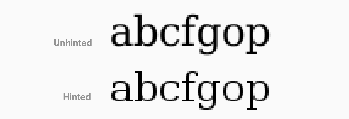
Hinting: triage for typographic detail
This process of snapping letterforms back in line with the pixel grid is known as “hinting” (more technically inclined readers might recognize this as a form of antialiasing). In this painstaking process, instructions are added to the font file that help coax the lines of each letter back onto the pixel grid.
Source: Wikipedia
Hinting is best viewed as a form of triage – it can keep type from becoming blurry and smeared, but it can’t rescue valuable detail.
Manual hinting remains a time-consuming and arcane procedure. While automated tools remain an integral part of type designers’ workflow, they often serve as a starting point for further refinement rather than an endpoint. On typefaces that have been designed primarily for print use, this manual tuning is often not performed. Automated tools that convert print fonts into web fonts (this means you, Fontsquirrel) produce particularly uneven, poorly hinted results (not to mention the licensing concerns!) These hinting instructions will subsequently be interpreted differently across browsers and operating systems, making for even less predictable results. This means that not every font that shows up on a screen is a good screen font.
How word recognition works and why it's important for UX
In case this all sounds like a largely aesthetic concern, it's worth stepping back to consider how poor legibility impacts UX. As typography researcher Kevin Larson carefully enumerates, when the distinguishing characteristics of each letter erode, it quickly becomes difficult for readers to differentiate between similarly shaped letters. In older models of reading this wasn’t seen as a major concern. Word recognition was thought to depend on word shape or "bouma shape"; you simply had to make sure that the word’s overall shape was consistent and readers would get the gist of it and match it to an accompanying stored pattern. This view has long since been overturned within academia, but it remains surprisingly common among type designers and typographers.
As Larson explains, contemporary models of reading instead describe a network-style “parallel recognition” model in which individual letters are identified and matched against established patterns. This means that when a reader encounters glyphs that look similar to one another they must perform the work of puzzling through the array of available options for each eroded letter. This process saps attention and focus, and slows the reading flow.
Identifying typographic problems in user research
Poor readability has obvious implications for UX, but can often be tricky to diagnose from user research. Users will often rightly voice their frustration when transgressions against legibility are really bad (e.g. tiny body copy or hairline stroke weights at small point sizes). In more marginal cases however, they might point to other aspects of the design. In the 2012 MIT/Microsoft study for example readers of poorly set type reported a lower sense of control and increased difficulty completing their goals. A UX researcher approaching this feedback might easily overlook typography as the root cause and instead look to other aspects of the design such as the layout or Information Architecture. In this case, there’s no substitute for getting hands-on feedback about your type: careful consideration during design reviews and prototyping/testing on real devices is essential.
How High DPI screens fit in
High DPI screens offer the best path towards better web type. Frequently offering upwards of 200 pixels per inch, these displays capture essential nuance and open up a world of previously unavailable typographic styles and applications. High DPI displays have becoming standard on most modern mobile devices, but remain limited to high-end desktops and laptops. Unfortunately, they won’t be ubiquitous any time soon. Outside of closed ecosystems (e.g. app development for modern iOS devices) they are simply an added support target that must be considered.
Alright – so we understand why screens are tough and appreciate why this matters more broadly for the UX of reading. How can we do better? In the second part of this post, I'll outline some best practices for choosing screen typefaces and look at a few emerging approaches that promise to help us set more context-aware type.