“Hey Tina, I’m gonna buy this sick tee online.”
“I dunno, I don’t think you’re supposed to put your credit card online.”
“I think I’m gonna buy it. I think it’s safe now.”
“Are you sure? I mean, there’s not even a little padlock icon anywhere.”
“Good point. I didn’t even notice that. Close call. I guess I’ll have to wait to get this sick ‘Guns out Buns out’ shirt.”
How many times has this scene played out in your home? Probably none. But it might be happening inside your brain without you knowing it. Fusionbox has long prided itself on making safe, secure, custom Python software -- but that’s only one side of a trustworthy online experience. If everything on the back-end is super-securely encrypted, would you know? How do we convince you that it’s safe to proceed? Sure, the browser plops a nice little green lock icon in the address bar, but is that enough to consider the site trustworthy?
Thank goodness for design! By sticking to a few simple design guidelines, your secure site will actually feel secure and instill confidence in your visitors.
Consistent, Clear Messaging

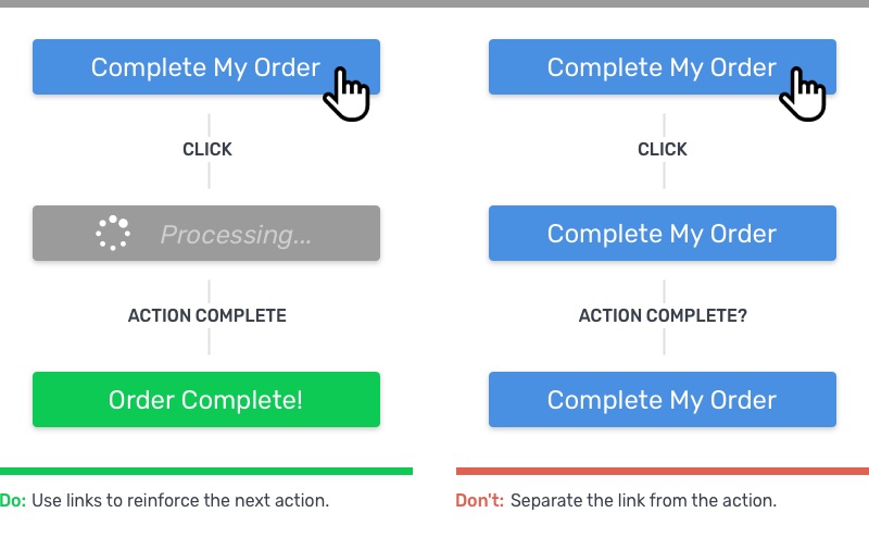
How often do you see a form submit that just says “Submit”? I mean, it’s the default language, so it shouldn’t be that surprising. But therein lies the problem -- without offering your visitors a glimpse into what they’re doing, you’re sending another, inadvertent message alongside it: “We didn’t really look at this form you’re about to submit.” It’s a small thing, but by customizing the text on actions to be contextual and active, you’re telling the user exactly what they’re doing -- while at the same time, sending that subtler message, “We looked at this, and we thought of everything. And by everything, we mean the front end and the back end. It’s all good. C’mon in.”
- Avoid using standard action words, and use more descriptive, direct messaging. It reduces friction and boosts confidence (and conversions, while we’re at it, because who doesn’t want more dollars?).
- Tell your users where they are, and where they’ll go next. Use breadcrumbs or simplify your site’s page structure to keep your users from feeling lost. All links should be self-descriptive. Instead of “click here to download report”, link the action itself: “download report”. That will keep your users oriented and help maintain trust. (I clicked on something, and it clearly took me to the thing I wanted. No nefarious redirection, hooray!)
- Make use of triggered and automated microinteractions. If you’re unfamiliar with the term, do yourself a favor and check out our more detailed review of microinteractions over yonder. I’ll wait...Now that you’re an expert, put microinteractions to work! A major contributor to software distrust is not knowing what its doing. I mean, most evil supercomputers don’t exactly spell out what they’re up to when you’re not looking. I don’t remember HAL saying, “Uh, Dave, better hurry up, imma close these pod bay doors in like 5.” Use microinteractions to tell the user what the system is up to, both when the user clicks on something (triggered) or if something happens that requires their attention (automated). By being transparent with your users, you’re showing that you’ve nothing to hide.

Addressing Sensitive Information
I don’t know about you, but I still get bristly when asked for my social security number. Or even my birthday. Or my mom’s maiden name. Especially online. The dangers of identity theft and social hacking are 2legit2quit, and it’s absolutely expected that the savvy user will be suspicious when asked for personally identifiable information (PII). So, show them you are being extra, extra careful with it.
- Highlight personally sensitive information form fields. By adding a border, a shaded box, or a padlock icon next to these fields, you’re showing the user that you’ve thought about them: “This is important to you, and we recognize that, so go ahead -- you’re in good hands.”
- Highlight payment methods in the same way. By showing accepted payment types and separating the payment fields from the rest of the form, you’re demonstrating care for the users’ financial security.
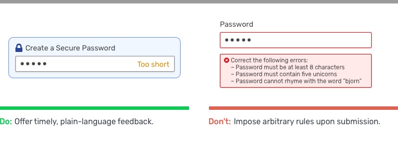
- Passwords are no exception. Slap that lock icon (judiciously) next to password fields, and be sure to include friendly messaging about how to craft a secure password. Rather than imposing arbitrary rules, offer plain-English feedback of what a secure password should look like -- because you, the designer, are concerned about their anonymity.

Nip Those Bugs
Bugs happen to everyone. Anybody who claims they’ve developed an app without any bugs is A LIAR AND A TERRIBLE HUMAN BEING likely mistaken. But it doesn’t mean you should be satisfied with buggy software. Encountering an error, or even a broken layout, during a crucial stage of conversion will not only kill the users’ confidence, but the negative word-of-mouth cannons can easily sink your sad, buggy ship.
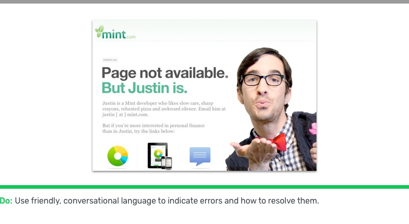
Test your code frequently and thoroughly. It seems like an obvious point, but it’s still one worth making. If you haven’t had the time or resources to fully test every scenario, then you’re not ready to launch. Simple oversights like broken links can ruin the experience, and in turn, your visitor’s confidence. If a legitimate error is encountered (hey, we all forget to check the Terms & Conditions box sometimes, right?), write the site’s responses in friendly language instead of “ERROR 3483248: PROBLEM”.

Test Your User's Scenarios
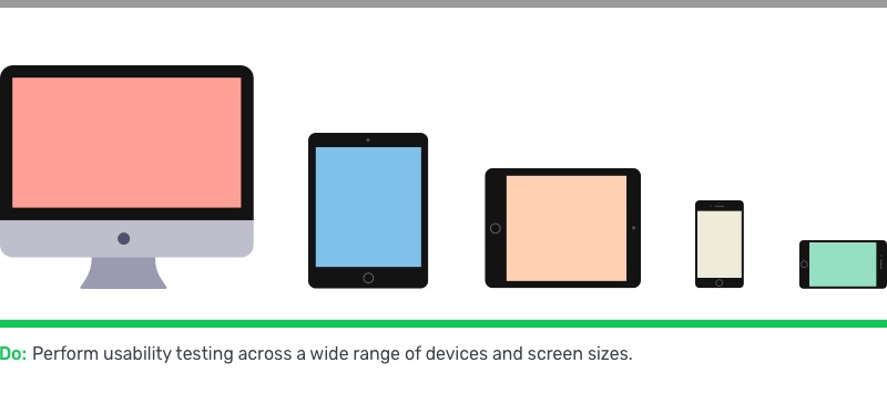
Try the app in different locations, times, and on different devices. Everything might look peachy at your cushy 30” 5K monitor, but that’s probably just a wee fraction of your users’ real-world setup. Test your software in daylight and darkness. Test it on tiny phones, huge tablets, and everything in between. Test it in Linux. Make sure each responsive breakpoint stacks up neatly and doesn’t make your site unusable. I came across a site where I really, really wanted to shut up and give them money -- but the gigantic sticky header and gigantic sticky footer made the payment form completely obscured. Oh well, slam dunk sale!

In Closing
Take advantage of standard UX practices when considering your application’s security. Making a few simple edits to your interface and interactions can make a huge difference in gaining your users’ trust.
Resources:
- https://baymard.com/blog/perceived-security-of-payment-form
- https://baymard.com/blog/visually-reinforce-sensitive-fields
Good UX can only come from caring about software and caring about people. At Fusionbox, we do both, with over 15 years of experience of designing effective UI and UX.
