 Let's Talk
As UX designers it's in our power to make forms more predictable, clear, and inviting. Forms often mark the point at which users drop out of our sales funnels, abandon their shopping carts, or simply lose their patience. How we choose to mark fields as mandatory might feel like a trivial detail, but research suggests that these simple indicators have powerful implications for how users perceive and complete forms. Early HTML form authors established the convention of using a red asterisk to mark fields as required. While this approach is familiar, succinct, and easy to implement, it's not without its downsides. When thinking through form UX we should weigh these costs and ensure that our choices reflect our users’ mental models and context.
Before addressing required labels themselves we need to step back and consider some commonly held assumptions about how users perceive forms. It's widely assumed that the form filling process is inherently unpleasant and disliked. This makes intuitive sense - forms require mechanical and cognitive effort, and often demand the disclosure of personal information. Based on these assumptions we'd expect users to carefully guard their privacy and avoid expending energy on optional fields. Surprisingly however, research on the topic suggests that these assumptions don't align with observed user behavior. A recent study concluded that "over-disclosure is a common occurrence and this is no accident. Across all levels of sensitivity, Web users provide data items for which they know disclosure is optional and not rewarded." Furthermore the study identified a "high prevalence of enjoyment" among participants when filling out forms, and indicated that over-disclosure was not viewed negatively by users who had done so. If you've ever had a frustrating form filling experience you will undoubtedly recognize that this sense of enjoyment is not without limits, but at the very least this reminds us that the user experience of filling forms is varied and can be highly context-dependant.
Another assumption behind the decision to mark required labels that should be reconsidered is the practice of marking only required fields. Differentiating only required fields implies that "optional" is the default state while "required" is the alternate. While this makes sense from a software design perspective it doesn't necessarily align with how users see forms. Again, Preibusch et al. offers insight, asserting that "in our experiment, we found that making some fields mandatory jeopardised voluntary disclosure for the remaining optional fields." When presented with required labeling users actually offered less information rather than more. By calling attention to fields as mandatory we further risk undermining users' innate desire to share information.
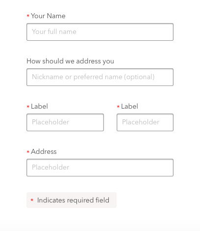
While the asterisk symbol is a long-held convention, it remains a potentially ambiguous icon without a clear semantic meaning. Analog typesetters have historically used asterisks to indicate omissions or footnotes, but this convention doesn't map neatly to its use on the web. While explanatory text such as "* indicates a required field” can help resolve this ambiguity this adds verbosity and adds another visual element that users have to scan. In order for this legend text to be most useful it should appear in the document flow above the the form fields themselves rather than at the end of the form. Unfortunately doing so breaks with the traditional layout pattern created by the analog footnote model. UX best practices dictate that when an icon lacks a single clear symbolic meaning it should be supplemented with or replaced by a label. While replacing an asterisk with the word "required" would address the issues with legend placement and reduce ambiguity, it's not practical or aesthetically ideal to do so. Furthermore this still fails to address the aforementioned drop off in disclosure caused by over-aggressive labeling.
While the most common implementation places the asterisk to the left of a field label, this harms the reading flow. The asterisk competes with the letterforms in the label text itself, adding visual clutter and affecting layout. Worse, the high degree of contrast offered by a red asterisk can work as a set of visual shortcuts that encourage users to bounce from point to point through content rather than flow through it in the natural reading order. While it’s tempting to assume that this represents a faster, more seamless, and therefore better user experience, this assumption is not necessarily supported by the data. The Priebusch study found that “Respondents who provided more data items...also enjoyed the form more”.
It's easy to perceive criticisms of the asterisk as nitpicky visual design grumblings. While that may be true, we should also consider that increased visual complexity can make a form feel more difficult. This clutter also affects visually impaired users and those relying on assistive technologies such as screen readers. Asterisks are unfortunately still not consistently handled by screen readers. Depending on the software package and user settings asterisks are either ignored or read out loud as "star". Appropriate ARIA properties will ensure that required fields are clearly delineated, but adding these labels will not guarantee that the asterisk will be skipped over.
In most cases good UX calls for reducing friction and making the form filling process as seamless as possible, but it's worth pointing out that this isn't always the case! In some instances the friction added by a prominent red asterisk can be valuable. If we're trying to ensure that a user sees the checkbox confirming that they're OK with the privacy policy, or need them to pause to acknowledge that their cart contains final-sale items a prominent red asterisk might be just the right way to slow things down. In other instances our users might be comfortable with or even enjoy a higher degree of perceived complexity. Software developers for example are often accustomed to high levels of symbolic abstraction and visual density. Expert users of software with forms often prize the sense of expertise that using more complex-feeling tools can offer. If, however we're looking to reduce visual complexity and make forms feel less intimidating we should consider alternative options.
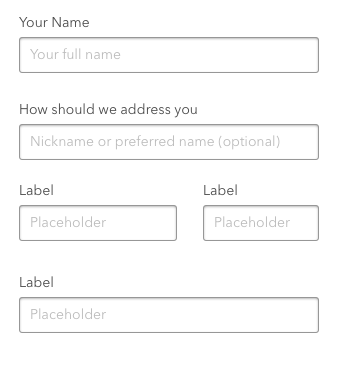
When approaching forms in which a majority of the fields are mandatory it is often best to mark only the optional fields and allow users to infer that unmarked fields are required. Placeholder text within the form field itself offers an unobtrusive opportunity to include optional labels. This approach leaves form layout intact and doesn't require the construction of additional styles. Explicitly adding (optional) alongside labels is another option that works well when it will appear sparingly.
Need UX Design Services or have burning questions? Get in touch. We are happy to help!