 Let's Talk

When I was a budding designer in my first “real” position, the digital world was a very different place than it is today: CSS was a Brazilian band, tables were the heart and soul of the Internet, and if you really wanted a top-tier website... Flash. We’ve come a long way since the drop-shadowed, texture-laden website designs of yesteryear. Mostly.
Back in ought-four, we built our websites with tables, a few inline styles, and a boatload of images. Extending the same method to HTML emails in marketing campaigns made perfect sense. Few email readers could even handle HTML at the time, but it was a nice perk for those that could—I mean, we were basically re-using the same HTML from the website, so why not? It was a big payoff for very little effort.
Fast-forward to today’s online landscape: Stylesheet-based animations! Drop-shadows supported as far as the eye can see! Responsiveness! Table-based HTML design!
You read that right, and you know it. All designers have come across this anachronism at some point in their careers. You’ve designed a beautiful, lightweight, responsive website, the code’s been put through the wringer, and every touch point is a branded, carefully-considered part of the UX. But when it comes time to style transactional emails to match that lovely theme, you’ve got to dust off those decade-old HTML skills and stumble your way through an email design that kinda-sorta matches your website.
Creating emails is clumsy, dated, and it’s still the only game in town. Few of the advances in web design are useful for email. Semantic HTML, external stylesheets, custom font-faces, and javascript are off the table.
Despite the crippling limitations of today’s email software, useful tips have circulated to bring email designs into the modern digital landscape:
1. G'head, Use CSS

Write it like you normally do, then hit up a CSS inliner.
Don’t break up your workflow for the sake of Outlook 2003. Write your stylesheets like usual (with attribute selectors for Yahoo!), then one of these handy tools to convert all your block styles to inline style tags.
Use the Margin hack (for IE/Outlook).
Margin was dropped in 2013 from some Microsoft email readers, creating headaches for anyone who likes space between things. Email on Acid found that capitalizing the word “Margin,” however, returns support of this essential style.

Use Microsoft conditional tags.
Another useful property, especially for creating responsive emails, is max-width. Various version of Outlook don’t support it, but a simple fix is to wrap a fixed-width column around your content -- and hide it inside conditional comments. Read more about this in Envato’s guide to creating a future-proof email template.
2. Responsify

Employ simple, mobile-first layouts.
People read emails on their phones, or at least scan them for further reading later. Take a mobile-first approach to email design: think single columns, simple layouts, with modular panels that can be adapted to your content.

Start with a touch-friendly UI.
Clicks often don’t convert on phones, though. Encourage clicks by making your tap targets larger, your copy legible, and your color palette crisp.

Media queries with alignment fall-backs.
Make use of CSS media queries (with fallbacks for Google) to reflow your content for larger screens. Give your elements more breathing room, up-size those images, and align sections into columns for desktop readers.
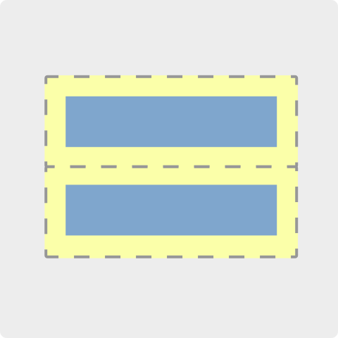
3. Retinize Your Images
Triple and quadruple your image sizes, then minify them.
Until image sets become an email standard, the best way to maintain crisp imagery in your emails is to save them 3 or 4x larger (Use a 1200x450 to be displayed as a 400x150 header). To alleviate the file bloat, run them through a compressor to trim the fat.

Set explicit image dimensions.
Be sure to set the pre-upscaled dimensions on your images to avoid displaying images 2-3x larger than intended:
<img src="image/this_file_is_1200x400.jpg" width="450" />4. Leverage Google’s Markup Schemata
Increase conversions by offering one-click actions and grid-layout offers.
Google Inbox is a major shift in the way we consume email. Add schema tags to your content to create one-click actions in email previews, or stylized grid content for Gmail’s Promotions tab.