 Let's Talk

Much of this article is based on Dan Saffer’s Microinteractions — so, if you’re familiar with it, or you are, in fact, Dan Saffer, feel free to reach out with corrections.
Solving problems with UX is often based on high-level, macro thinking. Microinteractions serve as a counterpoint to this 10,000-foot view of an application. We improve the user’s experience by solving small, self-contained problems within the app. We’re not merely fixing bugs; well-designed microinteractions elevate the entire experience and can become integral—even synonymous—with the brand. Can you think of “swipe right” without also thinking of Tinder? When we create effective microinteractions, they seem almost obvious—organically and fluidly integrating with the larger experience.
What is a microinteraction?
- Accomplish a single task only (“adjust playback rate” within a podcast player)
- Interact with a single piece of data (add a new stock to a ticker, adjust the search radius)
- Control an ongoing process (change channel, adjust volume)
- Adjust a setting (dropdowns, checkboxes, sliders)
- View or create a small piece of content (“compose message”, “record video clip”)
- Enable or disable a feature or function (light switches or toggles)
- Provide timely messaging: We can reduce the user’s cognitive load by making sure they never have to ask “did I do that right?” Microinteractions can be used to surface information and actions when they’re needed (“Incorrect password.”)
- Clarify an outcome: What’s going on behind the scenes? Microinteractions should clearly articulate otherwise ambiguous aspects of an application's state (“File uploaded.”)
- Provide real-time feedback to tactile adjustments: When you adjust your smart thermostat’s temperature, it shows the time remaining until the set temperature will be achieved. If a user changes a filter in a search form, the number of results should update in response. If a user drags a file into an upload area, the app should show the file’s upload progress.
- Offer user guidance: We can help establish usage patterns - microcopy and subtle UI cues can indicate to the user what they can and should do next.
- Reinforce a brand's personality or values: Microcopy and playful interactions are often a good place to add a touch of humor without being overly cheeky or infantile.
Ingredients of a Microinteraction
1. Triggers
The trigger is what initiates the microinteraction, and should always initiate the same action.
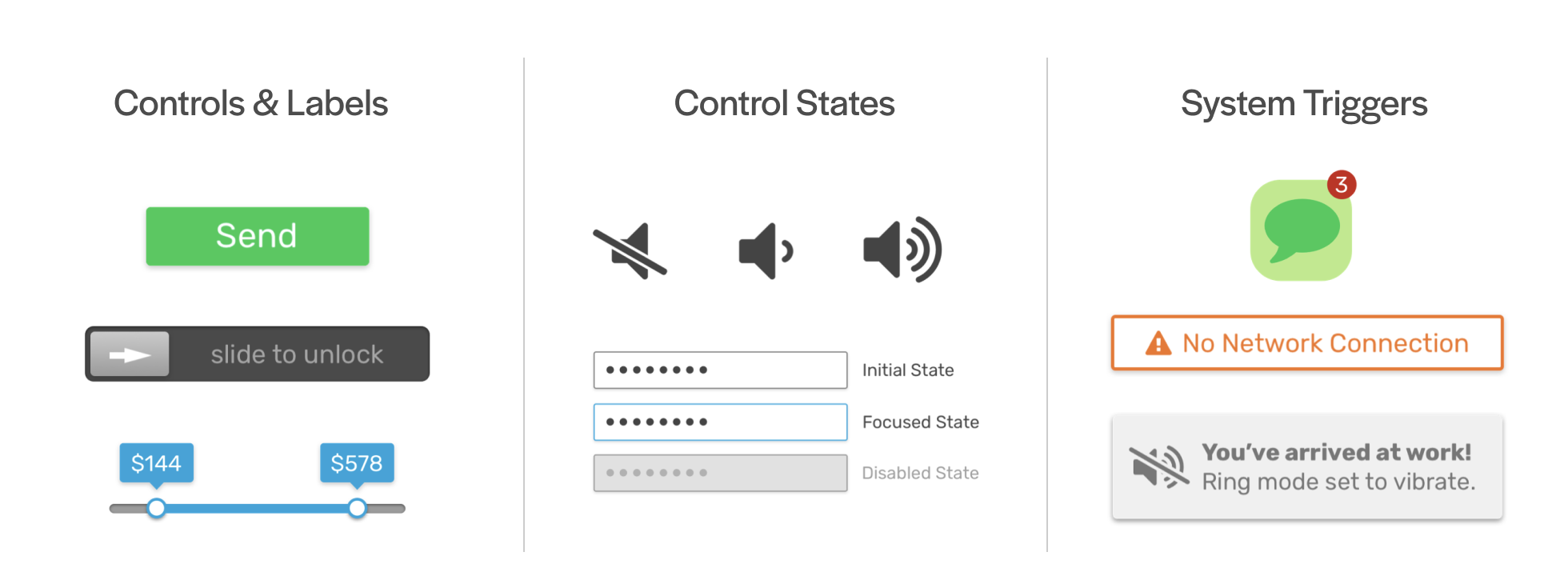
There are two primary types of triggers: manual and system. Manual triggers are initiated from a user action; things like buttons, sliders, and form inputs—things the user interacts with directly. System triggers are initiated by a set condition in the application, like a new message indicator, a network connection problem, or reaching a GPS coordinate.
The Hierarchy of Triggers
We know the different types of triggers, and we know that they should be consistent. But how do we strike a balance within the application? If every action in the app is “the most important,” none of them are important. In order to establish a hierarchy of actions for the user to take, we can adjust combinations of movement, affordances (does it look like I can interact with it?), icons, and labels to increase or decrease the trigger’s discoverability, or, its importance to the user.
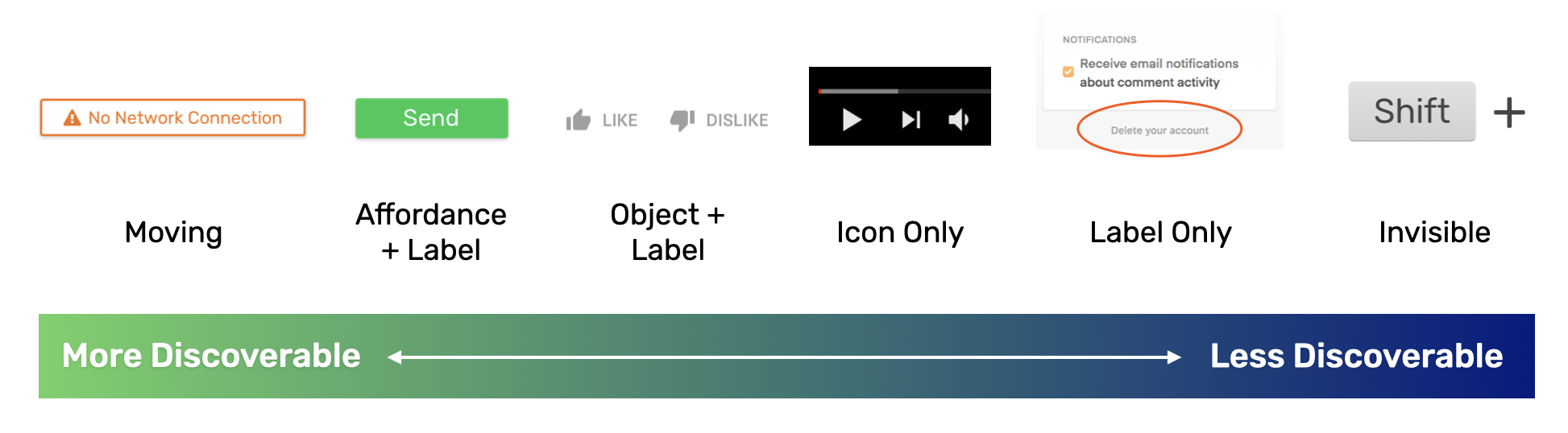
When to Surface a Trigger
Not every trigger needs to be static and visible in the app at all times. They can be invisible until needed (scroll bar), hidden after they’re less likely to be needed (onboarding help), or activated only when usable (“next” buttons that have to wait for a file to finish uploading). Trigger appearance timing can help anticipate the user’s needs and reduce visual clutter.
2. Rules
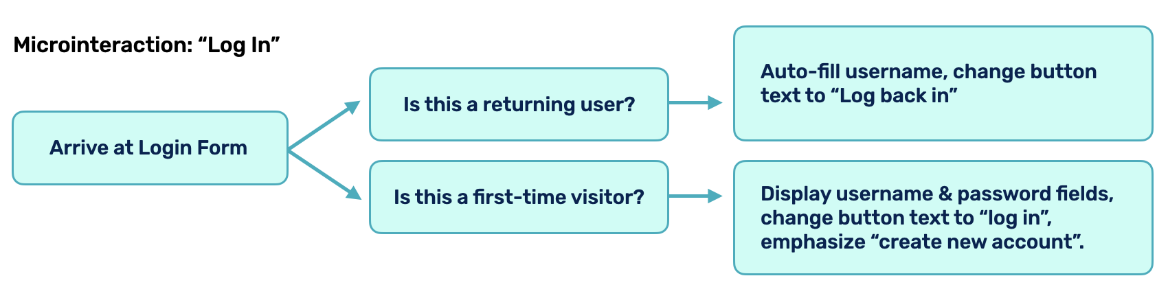
Now that we know what a microinteraction looks like, let’s talk about how it’s designed to function. A microinteraction’s rules determine how it functions and what happens throughout. Think of your microinteraction as a concise sentence: you should be able to describe your microinteraction succinctly, and if you can’t, it’s probably too complex to be a microinteraction. Try mapping out what happens with a flow chart—it should be simple enough to create a mental model from beginning to end. Try breaking it down into smaller components and treat each one as a separate microinteraction if simplicity is hard to achieve.
States
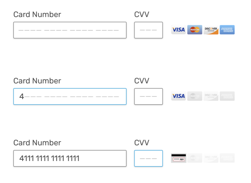
States convey the user’s progression through the microinteraction’s rule set. For example, when a user enters the first digit of a credit card number, the system knows which card type it’s dealing with (Visa, Mastercard, Diner’s Club—Diner’s Club?—Diner’s Club.), and can reflect that information to the user, confirming their input and visually guiding them through the entry process. This is different from a trigger state (default vs. hover state), which indicates what can happen, whereas a microinteraction state indicates what has happened.
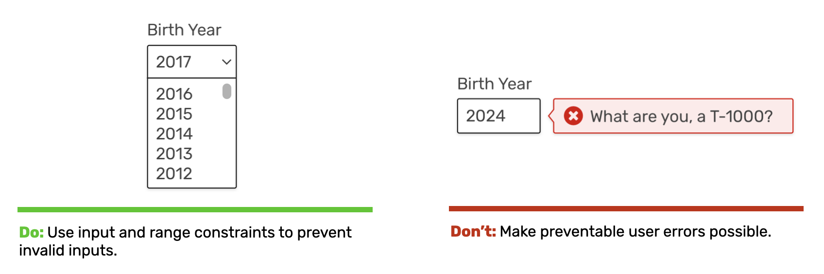
Constraints
Constraints help enforce a microinteraction’s rules without relying on lengthy explanations. We can utilize microcopy (password requirements), smart defaults (auto-detect the user’s location to fill the Country field in a form), and best-practice UI patterns to breeze your users through each step without getting hung up on how to progress.
Microinteractions should help place more responsibility on the app and less responsibility on the user. Their purpose within the app is to reduce complex decisions into small, discrete, easily-understood steps. The system should handle higher-cognitive load issues like computations, simultaneous tasks, remembering things, detecting patterns, and searching through large data sets.
3. Feedback
When the user performs some action within a microinteraction, we have to tell the user that something happened. A microinteraction’s feedback should tell the user the result of what they just did and what they can or can’t do.
Feedback should illuminate the microinteraction’s rules without overburdening the user. We accomplish this by succinctly delivering responses to the user in a natural and obvious way. A text response is the most common, but colors, icons, sounds, haptic feedback can also give the user useful information about what’s happening in the microinteraction.
Get Creative
We can use existing UI elements to convey information to the user without adding more “stuff” to the app. Cursors, progress bars, tooltips, and subtle animations can deliver information without relying on obtrusive modal windows or wordy responses.
Be Funny (or at least Human)
Because microinteractions are brief, moments of personality are more likely to be interpreted as endearing, not intrusive or annoying.
Errors, when they do occur, can be handled with a consistent tone and a touch of humor to put the user at ease.
4a. Loops
How does this microinteraction change over time, or when used repeatedly? How about if it hasn’t been used in a long time? If a user is looping through a microinteraction at different intervals, we can use that information to adjust how the interaction proceeds.
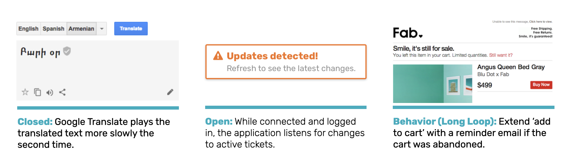
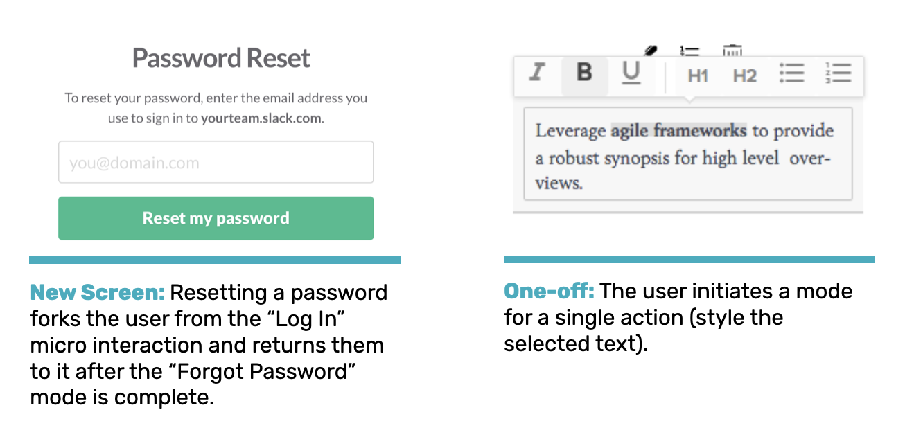
4b. Modes
What if the microinteraction becomes too cluttered or complex? Modes allow us to jump out of a microinteraction’s flow to engage in a smaller, but related, microinteraction, then return the user to the original microinteraction. Modes should generally be avoided, as microinteractions should work for a single task; adding modes increases cognitive load, but is sometimes the best way to maintain the user’s focus. A mode should feel like a quick offshoot from the primary task and not an entirely new flow. A user should never have to ask, “Which mode am I in, again?”
Final Takeaways
- Practice good UX.
Knowing your users’ goals and context informs good design decisions—even the little ones. - Use the overlooked.
Standard UI elements are opportunities to create meaningful, informative, and delightful microinteractions. - Don’t overdo it.
Make sure your microinteractions blend into your application fluidly and simplify your users’ decision-making process.
Resources:
“Microinteractions: Designing with Details” by Dan Saffer (O’Reilly)